The Enduring Appeal of NASA’s ‘Worm’ Logo: A Cultural Phenomenon
Written on
The Return of the ‘Worm’ Logo
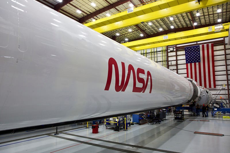
NASA astronauts recently made a safe return to Earth, splashing down near Pensacola, Florida, after their mission to the International Space Station. This historic journey, facilitated by SpaceX, marked the first manned launch from U.S. soil since the retirement of NASA's shuttle program in 2011. While the mission itself was remarkable, it also reignited interest among design enthusiasts and NASA supporters for another reason: the revival of the "worm" logo.

Designed by Richard Danne and Bruce Blackburn from the Danne & Blackburn agency in 1974, the wordmark was officially adopted by NASA in 1975 and phased out in 1992. However, this year, it has made a notable comeback, leading to a resurgence of its cult following. Its cultural relevance has reached such heights that SpaceX was eager to revive it for their recent launch, according to Danne.
The Question of Popularity
So what accounts for the enduring fascination with a logo that was used for just 17 years and has been absent for 28? The answer lies in three main factors: its removal, its design, and its broader symbolism beyond NASA.
Initially introduced during a transformative period at NASA, the logo aimed to provide a cohesive visual identity for numerous departments. As Danne noted, it was essential to create a straightforward visual solution to unify the various elements within the agency. Thus, the "worm," initially received with some skepticism, was introduced to complement the more complex meatball logo, which was harder to read from a distance.

Fast forward to 1992, when the logo was retired under the direction of then-NASA administrator Dan Goldin. Allegedly unsatisfied with the worm, Goldin opted to reinstate the meatball as the primary emblem. Despite the official retirement, the worm's absence sparked a wave of nostalgia, particularly among younger generations. As Danne remarked, the logo gained visibility post-retirement, becoming a staple in various unrelated products. This phenomenon aligns with a broader trend, as noted by Jesse Reed, co-founder of Order design and Standards Manual. “The general public likely sees it as a nostalgic and retro representation of NASA,” he explained.
The Design Excellence
One of the key reasons for the worm's pervasiveness in popular culture is its outstanding design. Reed emphasizes that the logo's structural elements—particularly the As and the similar N and S—create a harmonious composition that exemplifies excellent graphic design. The shape of the As resembles rocket nose cones, evoking a sense of vertical thrust and drawing inspiration from aerospace aesthetics. The logo's monoweight gives it a machine-like quality, almost as if it were crafted from metal.
The intricacies of the design may go unnoticed by many, but they contribute to its versatility. Reed adds that the logo was crafted with various applications in mind, from letterheads to spacecraft, unlike the meatball logo, which lacks the same design considerations.
The Symbolic Significance
Danne argues that the simplicity and elegance of the logo also convey deeper meanings. "NASA embodies adventure and exploration," he states, contrasting it with other government agencies like the Department of Transportation. In just four letters, the worm encapsulates innovation and forward-thinking. Historically, it has been associated with a younger, progressive demographic within NASA, who embraced its introduction in the 1970s and have since risen to leadership roles.
Ultimately, Danne himself is still amazed by the logo's lasting popularity, and he is currently serving on a NASA committee dedicated to expanding its use, inspired by the SpaceX model. "I think we got it right, and we rang a bell that continues to resonate," he concludes. NASA seems to share this sentiment.
Chapter 2: The Legacy of the NASA Worm Logo
This official NASA broadcast explores the legacy of the iconic worm logo and its significance in the agency's history.
Chapter 3: NASA 'Worm' Logo Standards
This video delves into the logo standards established for NASA's 'Worm' logo, offering insights into its design principles and historical context.