Creating Stunning Web Designs: A Comprehensive Guide
Written on
Chapter 1: Importance of Design in Frontend Development
Having a strong design sense is vital for frontend developers. Throughout my career, I've faced numerous situations where my creativity and skills were essential in crafting visually striking web pages, especially during personal projects or hackathons. Below are some crucial guidelines that I've found invaluable—consider this as your go-to cheat sheet for building your own web pages.

Typography Essentials
When it comes to titles and headings, opt for large font sizes, such as 90px, 60px, or 32px, depending on the emphasis required. Utilizing a lighter font weight can enhance the overall elegance of your design. For body text, aim for sizes between 15px to 25px, with line spacings ideally set between 120% to 150%. It's also recommended to keep the character count per line between 45 to 90 for optimal readability. Selecting visually appealing fonts is crucial.

Choosing the Right Fonts
For modern aesthetics, consider fonts that resemble Sans-Serif, such as Open Sans, Lato, or Raleway. Serif options like Cardo and Merriweather can also add a classic touch.
Color Selection
Beyond your primary color, incorporating a secondary color can help highlight key actions or calls-to-action. For instance, on Facebook’s login page, blue is used as the primary color, while green draws attention to important buttons.

Improving Text Readability on Images
When placing text over images, ensure readability by avoiding direct overlays. Here are effective techniques:
- Overlay Color: Apply a color overlay on the image before adding text.
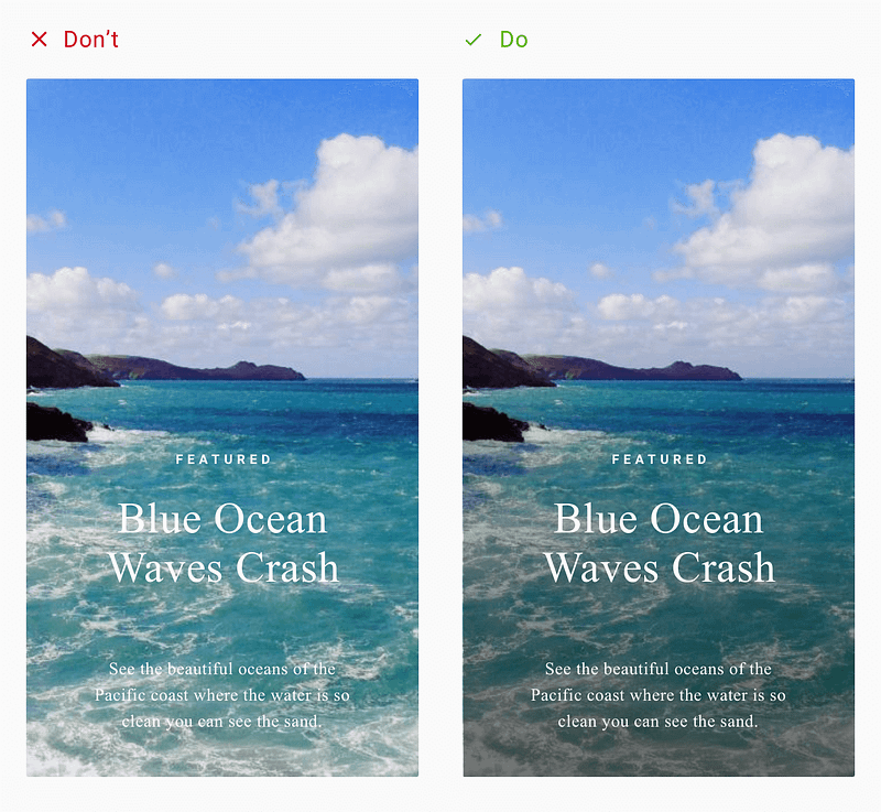
- Opaque Box: Position the text inside an opaque box to maintain visibility of both text and background image.

- Blur Effect: Blur the image partially or completely where text is placed.

- Fading: Gradually fade the image towards one side while overlaying text.

Icon Usage
Incorporate icons to illustrate features or steps on your website. For instance, Shopify effectively uses icons to convey key actions.
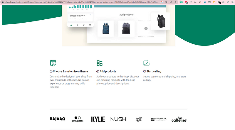
Utilizing vector icons (SVG) is advisable to ensure scalability across devices without pixel loss.

The Role of White Space
Implementing white space between elements and sections aids in establishing visual hierarchy. However, be cautious not to overuse it.

Focusing on User Experience
Lastly, validating the user experience of your design is crucial for creating meaningful interactions that align with business objectives. If you're working on a personal project, consider joining frontend or UX communities to gather feedback on your design.
By adhering to these guidelines, you can create a cohesive web design that serves as a robust foundation for your future projects. If you found this information helpful, please share your thoughts in the comments below!
